2012 - Reimagining the First 19 Rounds
 Thursday, August 9, 2012 at 8:31PM
 A footy season, once witnessed, is hard to imagine having turned out any other way.
It's difficult, for example, to conceive of a universe where Collingwood sit 10th on the ladder, or one where Richmond sit 5th. But not only are these situations conceivable, we can estimate just how likely they are by adopting the same simulation approach that we used to project the games for the remainder of the season. (It turns out that the likelihood of the Pies lying 10th or the Tigers 5th are both about equal at around 7%).
To come up with these estimates we assume that the scores of the two teams in every game have been drawn from a bivariate Normal distribution with mean equal to the actual scores from the game and with variances equal to 659.2 for the Home team score, 659.9 for the Away team score, and with covariance equal to -65.6 (ie the variances and covariance estimates are as per those we used in the previous blog and amount, roughly, to standard deviations for team scores of 25.7 points per game and a correlation between those scores of about -0.1).
In essence, what we're asserting is that our best estimate of each team's expected score in any game is the score they actually recorded and that the level of uncertainty associated with any game is a constant. We're also assuming that the scores in any one game are completely independent of the scores in another (or, at least, that any dependence is captured in the actual results themselves and that any deviations from these actual results in a simulated world can be assumed to occur at random).
There are other approaches that we could adopt instead for the purposes of simulation, such as using the bookmaker's pre-game implicit probability estimates for every game, but the underlying insights would be the same: that team footy scores are random variables, that the result that actually transpired in any game is not the only conceivable one, and that, without changing anything about the relative skills of the teams in the competition, the current ladder could look very different.
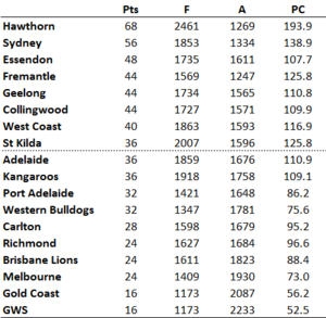
Adopting the approach described above I simulated 1,200 replications of the first 19 rounds of the season and then created the competition ladder for each simulation. Here, for example, is the ladder for one such simulation (one that should please any Dons or Freo fans):
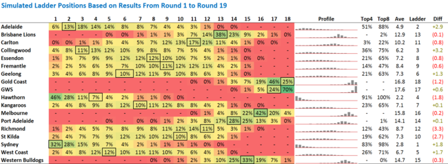
The results for all 1,200 simulations are summarised below.
The percentages on the left record the proportion of the simulations in which the listed team finished in a particular ladder position. So, for example, Adelaide finished 1st in 6% of simulations, 2nd in 13% more, and so on. The boxed percentage in each row corresponds to that team's actual current ladder position.
It's apparent that a number of teams currently occupy ladder positions that are not their most common position based on the simulations. Hawthorn, for example, finished atop the ladder in almost one half of the simulations, but currently lies only 4th on the ladder. This perhaps explains why the Hawks are the $2.50 favourites for the Flag on the TAB right now.
Also, some teams have a quite narrow range of ladder positions in which they finished in the majority of simulations - GWS, for example, finished 17th or 18th in 94% of simulations - while others have a very broad range, such as Richmond and Geelong.
One way of estimating how "lucky" or "unlucky" a team is to be occupying the ladder position that it currently does is to compare its average ladder position across the simulations with its current actual ladder position. This comparison is made in the rightmost column where positive numbers reflect "good" luck and negative numbers "bad" luck.
On this measure, Richmond, St Kilda and Hawthorn are the unluckiest teams, each lying about 2 or 3 ladder positions lower in real life than they do, on average, in the simulations. Collingwood, Adelaide, Sydney and West Coast, on the other hand, are the luckiest teams, each sitting 2 or 3 ladder positions higher on the actual competition ladder than they did in an average simulation.
Finally, it's interesting to note how closely the average simulated team rankings mirror those of our Rating Systems. The Spearman Rank Correlations are:
- p(Average Simulation Rank, Massey Rank) = +0.969
- p(Average Simulation Rank, Colley Rank) = +0.946
- p(Average Simulation Rank, ODM Rank) = +0.928
- p(Average Simulation Rank, MARS Rank) = +0.926
The correlation with actual ladder positions is highest of all, however, at +0.975.
 TonyC |
  Post a Comment |


Reader Comments